
Color Theory
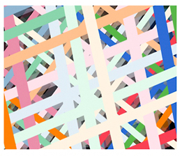
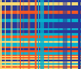
Tetradic (Double Complementary) Color Scheme
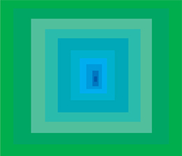
The tetradic (double complementary) scheme is the most varied because it uses two complementary color pairs. This scheme is hard to harmonize; if all four hues are used in equal amounts, the scheme may look unbalanced, so you should choose a color to be dominant or subdue the colors.
Split Complementary Color Scheme
The split complementary scheme is a variation of the standard complementary scheme. It uses a color and the two colors adjacent to its complementary. This provides high contrast without the strong tension of the complementary scheme.
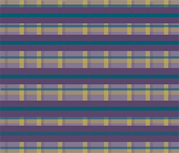
Triadic Color Scheme
The triadic color scheme uses three colors equally spaced around the color wheel. This scheme is popular among artists because it offers strong visual contrast while retaining harmony and color richness. The triadic scheme is not as contrasting as the complementary scheme, but it looks more balanced and harmonious.
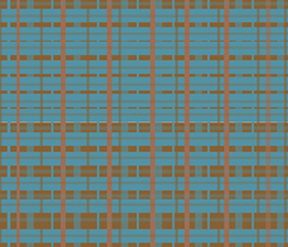
Complementary Color Scheme
The complementary color scheme consists of two colors that are opposite each other on the color wheel. This scheme looks best when you place a warm color against a cool color, for example, red versus green-blue. This scheme is intrinsically high-contrast.
Analogous Color Scheme
The analogous color scheme uses colors that are adjacent to each other on the color wheel. One color is used as a dominant color while others are used to enrich the scheme. The analogous scheme is similar to the monochromatic, but offers more nuances.
Color Theory
Tetrad
Split Complementary
Triad
Complementary
Anagolous
Color Theory
Color is such a pervasive part of everything we visually encounter in the world, that for many designers it becomes an intuitive choice. If you think back to primary/elementary school though, you'll recall being told that there are three "primary" colors - Red, Yellow, and Blue. We were all taught that any color can be created by mixing these three colours in varying quantities. It turns out that isn't quite right.
Understanding how color is formed and, more importantly, the relationships between different colors, can help you to use color more effectively in your designs.

- Trivdiv
Tridiv is a web-based editor for creating 3D shapes in CSS. It’s free - Smashing Magazine
- dafont
Free Fonts - W3C sites
Excellent selection of valid W3C sites - CSS3
The site of future standards – CSS3 - Lighthouse
Accessibility Guidelines for the Web Designer - i love typography
Speaks for itself. A must know - All Graphic Design
A site for everything graphic design related - Communication Arts Magazine
Communication Arts – The essential creative resource - AIGA
AIGA, the professional association for design, is committed to advancing design as a professional craft, strategic advantage and vital cultural force